Flat Design
Flat Design websites are so atractive because of the minimalist approach. As in, there is not too much stuff going on that it is unbearable, but it is not too little that, it looks bland.
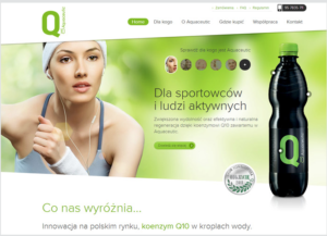
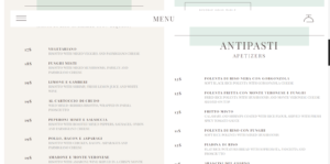
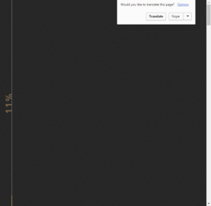
The three website styles I would take from for a personal chef would be, tioluchin.com, risotteriamelottinyc.com, and aquaceutic.pl
This is why for each of them:
- tioluchin – the loading bar on the side of the page
- risotteriamelottinyc – The menu
- aquaceutic – the slanted homepage
My three favorite tags on awwwards.com are:
- Animation – The sites share an animated aspect, such as interactivity. Sites that involve animations such as mediaelection.com are what would go in this category. These sites appeal to me because, I enjoy the interactivity and find most to be aesthetically pleasing.
- Graphic Design – These sites are all specifically made to be aesthetically pleasing. mediaelection.com is also included in this category because it is very graphically pleasing. The graphic design sites are great for sites that you want to show off your artwork and things of that nature.
- Minimal – This type of website is usually pretty bland, but not so bland, you just leave the site. A good example of this is trefectamobility.com. It has a nice simple design. I like this style because of how simple and sleek it is.


