10 Semantic Tips

10 design tips for a semantic website

  1. Standardize objects – Make things that are similar use the same class tag.
  2. Use comments – Make sure you and anyone else looking at the code understands what is going on.
  3. Semantics can be described as – describing with out specifically saying what it is.
  4. You have to be sure there is only one of something on a page to use ID tag instead of Class tag.
  5. If you have two tags on an object, the second one will override the first.
  6. Part of being semantic is keeping your code clean.
  7. Screen readers read from top to bottom according to the code.
  8. You should use labels on your text fields even if you will kick it off the page later.
  9. You can use a tag multiple times and style it differently by specifying the area of the code IE:

h4 {   color: red; } .p3 h4 {   color: green; }

Making the only difference being it is green instead of red, in the p3 class.

  1. <small> is meant for extremely small text such as copyright info.
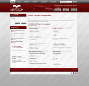
dewantara-academic

5 Things about creating a predictable and harmonious spacing system

Predictable and Harmonious spacing is useful because it not only makes everything look better, but it also is used to deliberately for improved readability and consistency in product.

2 practical steps to create a predictable and harmonious spacing system.

  1. Baseline grid – Determine line-height of your body text and know your baseline grid number.
  2. Geometric progression – Pick a limited number of values from the geometric progression of your baseline grid number’s factors and multiples.

Rule of 3Cs

  1. Rule for containers – Apply uniform inset spacing inside all containers in your UI.
  2. Rule for content – Content is stacked vertically. Tackle the header stack first, by trying to get to a margin value that works consistently across all headers.  Solve the leaf -node stack next, by addressing spacing needs for paragraphs, lists, form, tables.
  3. Rule for components – Apply uniform inline spacing for all adjacent components in your UI. Make exception with smaller spacing only for components that are associated together.

When positioning elements vertically, the designer has to make decisions that never should be left to chance or be random. Too often, designers rely on vertical increments made possible in Photoshop by holding shift and arrows keys: “I use 5 or 10px, it depends.” This approach is acceptable horizontally, as columns are multiples of 10, but it doesn’t conform to any typographic reality.

— Robert Bringhurst (Author of “The Elements of Typographic Style”)


All of the information I gathered here, has come from Priyanka Godbole and prototypr.io

Click here for the article!

Top 5 things I recently learned about Google Analytics and SEO

Here is my list of the Top 5 SEO tips

Google Analytics

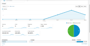
Google analytics (or GA) is a great tool that allows you to see how many people come to your website, as well as how many are new or repeat viewers.

This is a recent example of my current sessions by people.

G A also has many other functions that allow you to ensure that your website is running smoothly.

Broken Link Checker

If you have broken links on your site, it can confuse your audience, and leave a bad taste for your site. This can happen when, for instance, you have a YouTube video linked on a page, and the video has become no longer available. It can also be caused by changing the URL to a page on your own website, which leads us to our next tip.

Safe Redirect Manager

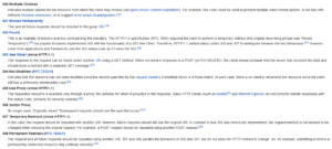
A safe redirect manager can help you automatically send people to the right page, if there is a problem with it. Depending on the situation it may show one of these error messages.

These are the redirect messages.

For example, if you permanently move a page to another place, it will give a 301 and then instantly redirects them to the proper URL.

Black Hat vs. White Hat

This info-graphic should help explain the differences between Black and White Hat Tactics. Black Hat Tactics can severely effect your reputation and make it difficult to get back your good reputation.

seo white hat vs black hat infographic By MarketingZen.com

OpenGraph and Twitter Cards

The main reason for including these in your code, is that if someone shares your link on Twitter or Facebook, it will show an image and a small description for your site. Depending on how you have it set up it may show one image for everything, or it may be an image from your article.