Contributing to an Open Source Project on GitHub

Contributing to an Open Source project on GitHub can be a lot like working in a real world office. For example, one person may pull the code from a project and proceed to add a feature or fix a bug. Next, rather than push it back up, they create a pull request where the supervisor or another team member is able to verify the code, and if accepted pull it to the repository.

Now, you may be asking yourself, “What do pulling the code from a branch, and pull requests mean?” In this article I will go through the steps one goes through once you are ready to make changes to a project.

Pull request

A pull request allows you to let other members of the project know that you have pushed a branch. In the example above, this would be for the boss to go over what you have done. This is very useful because, if something is not right, or the boss needs more from the update, they can deny it for revisions.

After initializing a pull request, you’ll see a review page that shows a high-level overview of the changes between your branch (the compare branch) and the repository’s base branch. You can add a summary of the proposed changes, review the changes made by commits, add labels, milestones, and assignees, and @mention individual contributors or teams.

Pulling the Code from a branch

You can use a branch to isolate development work without affecting other branches in the repository. Each repository has one default branch, and can have multiple other branches. You can merge a branch into another branch using a pull request. You can use branches to: Develop features, fix bugs, or safely experiment with ideas that will not effect others’ work.

The user must have write access to a repository to create a branch, open a pull request, or delete and restore branches in a pull request. In repositories where you have owner or admin access, you can change the default branch.


Click here for more information on:

Pull Requests

Branches

Ever Wonder Why Looks Are So Important?

If you have ever wondered why looks are so important, look no further! In this post I will go over three of the main ways to improve the credibility of your site.

Have an About Page

Having an about page is useful because, it can tell visitors to your site about your company, and you personally. It allows for the visitor to feel safer, as they know more about you and your company’s intentions.

Update your content regularly or hide dates

If you update your content regularly, more people will visit more frequently, especially if it is quality content. If you update regularly, visitors will see that you care about your content, and therefore probably them.

Watch spelling, grammar, and typos no matter how insignificant they may seem

Even if it is something as insignificant as spelling insignificant as insingificant, or even There vs. Their. This can make you seem like you don’t worry about small things, which could end up being big things in the end.

I got my information from Prove It: What Makes You Trust a Website? – Lorelle VanFossen.

I recommend you check out this article for more information on how to make your website look and feel more trustworthy.

Ethan Marcotte’s Responsive Design

Ethan Marcotte said that he wanted to make each screen size look different. It is none more apparent than the difference between Mobile and Tablet Portrait. They each have a specific design that is both very similar but different and the same time.


This is an example of the code for Mobile on the site.

@media (min-width: 768px) {
.dl-horizontal dt {
float: left;
width: 160px;
overflow: hidden;
clear: left;
text-align: right;
text-overflow: ellipsis;
white-space: nowrap;
}
.dl-horizontal dd {
margin-left: 180px;
}
}

Whereas with this example of the tablet in portrait mode, It has many more bits that effect the layout.

@media (min-width: 768px) {
.col-sm-1, .col-sm-2, .col-sm-3, .col-sm-4, .col-sm-5, .col-sm-6, .col-sm-7, .col-sm-8, .col-sm-9, .col-sm-10, .col-sm-11, .col-sm-12 {
float: left;
}
.col-sm-12 {
width: 100%;
}
.col-sm-11 {
width: 91.66666667%;
}
.col-sm-10 {
width: 83.33333333%;
}
.col-sm-9 {
width: 75%;
}
.col-sm-8 {
width: 66.66666667%;
}
.col-sm-7 {
width: 58.33333333%;
}
.col-sm-6 {
width: 50%;
}
.col-sm-5 {
width: 41.66666667%;
}
.col-sm-4 {
width: 33.33333333%;
}
.col-sm-3 {
width: 25%;
}
.col-sm-2 {
width: 16.66666667%;
}
.col-sm-1 {
width: 8.33333333%;
}
.col-sm-pull-12 {
right: 100%;
}
.col-sm-pull-11 {
right: 91.66666667%;
}
.col-sm-pull-10 {
right: 83.33333333%;
}
.col-sm-pull-9 {
right: 75%;
}
.col-sm-pull-8 {
right: 66.66666667%;
}
.col-sm-pull-7 {
right: 58.33333333%;
}
.col-sm-pull-6 {
right: 50%;
}
.col-sm-pull-5 {
right: 41.66666667%;
}
.col-sm-pull-4 {
right: 33.33333333%;
}
.col-sm-pull-3 {
right: 25%;
}
.col-sm-pull-2 {
right: 16.66666667%;
}
.col-sm-pull-1 {
right: 8.33333333%;
}
.col-sm-pull-0 {
right: auto;
}
.col-sm-push-12 {
left: 100%;
}
.col-sm-push-11 {
left: 91.66666667%;
}
.col-sm-push-10 {
left: 83.33333333%;
}
.col-sm-push-9 {
left: 75%;
}
.col-sm-push-8 {
left: 66.66666667%;
}
.col-sm-push-7 {
left: 58.33333333%;
}
.col-sm-push-6 {
left: 50%;
}
.col-sm-push-5 {
left: 41.66666667%;
}
.col-sm-push-4 {
left: 33.33333333%;
}
.col-sm-push-3 {
left: 25%;
}
.col-sm-push-2 {
left: 16.66666667%;
}
.col-sm-push-1 {
left: 8.33333333%;
}
.col-sm-push-0 {
left: auto;
}
.col-sm-offset-12 {
margin-left: 100%;
}
.col-sm-offset-11 {
margin-left: 91.66666667%;
}
.col-sm-offset-10 {
margin-left: 83.33333333%;
}
.col-sm-offset-9 {
margin-left: 75%;
}
.col-sm-offset-8 {
margin-left: 66.66666667%;
}
.col-sm-offset-7 {
margin-left: 58.33333333%;
}
.col-sm-offset-6 {
margin-left: 50%;
}
.col-sm-offset-5 {
margin-left: 41.66666667%;
}
.col-sm-offset-4 {
margin-left: 33.33333333%;
}
.col-sm-offset-3 {
margin-left: 25%;
}
.col-sm-offset-2 {
margin-left: 16.66666667%;
}
.col-sm-offset-1 {
margin-left: 8.33333333%;
}
.col-sm-offset-0 {
margin-left: 0;
}
}

Top 4 types of Website Designs

Flat Design

Flat Design websites are so atractive because of the minimalist approach. As in, there is not too much stuff going on that it is unbearable, but it is not too little that, it looks bland.
The three website styles I would take from for a personal chef would be, tioluchin.com, risotteriamelottinyc.com, and aquaceutic.pl

This is why for each of them:

  • tioluchin – the loading bar on the side of the page
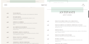
  • risotteriamelottinyc – The menu
  • aquaceutic – the slanted homepage
My three favorite tags on awwwards.com are:
  • Animation – The sites share an animated aspect, such as interactivity. Sites that involve animations such as mediaelection.com are what would go in this category. These sites appeal to me because, I enjoy the interactivity and find most to be aesthetically pleasing.
  • Graphic Design – These sites are all specifically made to be aesthetically pleasing. mediaelection.com is also included in this category because it is very graphically pleasing. The graphic design sites are great for sites that you want to show off your artwork and things of that nature.
  • Minimal – This type of website is usually pretty bland, but not so bland, you just leave the site. A good example of this is trefectamobility.com. It has a nice simple design. I like this style because of how simple and sleek it is.

aquacetutic-pl_slanted_homepage risotteria_melotti_nyc_menu tioluchin-com_sidebar

7 important tips and tricks to creating an amazing website!

The Five Best Things I have learned about coding.

In no particular order the coding tips I have learned are:

  • Characters Encoded – If it is a special character, it’s encoded.
  • Hierarchy – Title tags are reserved for real content, and follow a clear hierarchy.
  • IDs – Used anytime an element appears only once on the page and cannot be targeted any other way.
  • JAVASCRIPT – jQuery (the most beautiful JavaScript library) is served from Google. Only a single JavaScript file is loaded. Both scripts are referenced at the bottom of the page.
  • Valid – The markup adheres to W3C validation. Tags are closed, required attributes used, etc.

I have not been doing enough commenting, which I should. Commenting helps clarify bits of code, for someone else, or for yourself. You may have hundreds of lines of code, but if you want one specific bit of coding, your best bet would be to add some commenting.

The two things I needed to look up while learning more about this.

jQuery- as they say on their website, jQuery Logo

jQuery is a fast, small, and feature-rich JavaScript library. It makes things like HTML document traversal and manipulation, event handling, animation, and Ajax much simpler with an easy-to-use API that works across a multitude of browsers. With a combination of versatility and extensibility, jQuery has changed the way that millions of people write JavaScript.

W3C – The World Wide Consortium is defined as,w3c logo

The World Wide Web Consortium (W3C) is an international community where Member organizations, a full-time staff, and the public work together to develop Web standards. Led by Web inventor Tim Berners-Lee and CEO Jeffrey Jaffe, W3C’s mission is to lead the Web to its full potential. Contact W3C for more information.

Meaningful CSS: Style Like You Mean It (Discussion 10/02 – 10/04)

Meaningful CSS

Jeffrey Zeldman said “In a site afflicted by classitis, every blessed tag breaks out in its own swollen, blotchy class. Classitis is the measles of markup, obscuring meaning as it adds needless weight to every page.”

Semantic Coding

Semantic Coding is defined as “a specific type of encoding in which the meaning of something (a word, phrase, picture, event, whatever) is encoded as opposed to the sound or vision of it. Research suggests that we have better memory for things we associate meaning to and store using semantic encoding.

ARIA

ARIA is a technical specification published by the World Wide Web Consortium (W3C) that specifies how to increase the accessibility of web pages, in particular, dynamic content and user interface components developed with Ajax, HTML, JavaScript and related technologies. On 20 March 2014 WAI-ARIA 1.0 became a completed W3C Recommendation. The Author mentions it because it, along with other additional platforms, are included in the new age of coding.

Microformats

Microformats are HTML for marking up people, organizations, events,locations, blog posts, products, reviews, resumes, recipes etc. Sites use microformats to publish a standard API that is consumed and used by search engines, browsers, and other web sites. See what-are-microformats for more.

While looking around on the site this article was originally published, I found a good article about Graphic Design. If you are like me, then you are talented in some fields of web design, but you struggle in the graphic designing department. This article helps you understand what to do and how you can make it easier on you and a designer to work together.

Just remember, if you are bogged down with too much stress, take a break, relax, and keep an open mind.

Never Heard of It (Discussion 9/11 – 9/13)

Lyza Danger Gardner, the Author, points out that it is alright to admit you don’t know something, to seek help if you need it, and even though it may take some time, you can do what you want with enough practice/learning.

My viewpoints on this

I believe that I need to admit not knowing certain things. Many times I have been in situations where people expect me to know something, so I accidently lie about it. I am also a strong supporter of getting help. If you don’t no something, ask around. If need be, use Google or another Search Engine, and find out what you are looking for. Plus if you don’t practice or learn from your mistakes, what good are you doing yourself?

While surfing the web, I found a website that is specifically made to help make websites. This website is very useful, because it has courses on how to build a website, plus many videos about things like games from a coders perspective. I feel that if a person is having difficulties and cannot find help from a person, this a good website to use as a backup.